
Kanjis project episode 2: how to compare models? Matplotlib, TensorBoard, Plotly and Dash…
Thanks to episode 1, we now have some cool data. In episode 3, we will use it to train different models but how to choose the best model? We need to have some indicators to evaluate the quality of the different models we train. Here are the ones I want to look at:
- The evolution of the accuracy during the learning. Here, the important point is that we want to compare the accuracy on the training data and on the validation data. Because of course we want the best accuracy possible, but we also want to avoid overfitting. And we can detect it when the training accuracy continues to grow whereas the validation one is stagnating or even decreasing. Be also conscious that the accuracy is not perfect, even more with an unbalanced dataset. Indeed, it can give a false sense of performance: imagine a model that always predict the majority class, which would be 75% of the dataset. Then the accuracy would be of 75%, even though the model did not learn much about our data (except the fact a certain class has majority). Some alternatives exist, like F1Score (and I should implement it if I don’t forget before the end of this project).
- The evolution of the loss during the learning. And as for accuracy, we want to compare the training and the validation ones. They give some similar information but have a few differences:
- The accuracy is easier to understand and interpret, it gives an idea of the global performance of our model.
- The loss is more sensible to little improvements of the model, so it can be better to follow the progress of the learning, but it is harder to interpret and is dependent on the loss function chosen to train our model, so it is harder to compare to different models if they don’t use the same loss function.
- Some parameters and global indicators about the learning like:
- The batch size, the number of epochs and the learning rate (I’ll dig deeper into the influence of each parameter when we’ll discuss the different models I train)
- The total time needed to train the model
- The final test loss and accuracy: here we calculate them on the test data that was never used during the training, in order to avoid statistical bias and be sure that it will generalize well.
So for each learning, I want 2 plots and a table.
Start simple with what I know: good old matplolib
Not much to say about it, except that it is more customizable than what I remembered, and it worked well to plot everything at the end of a learning.
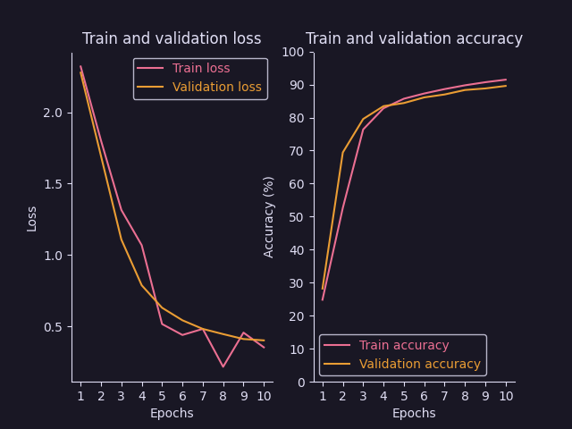
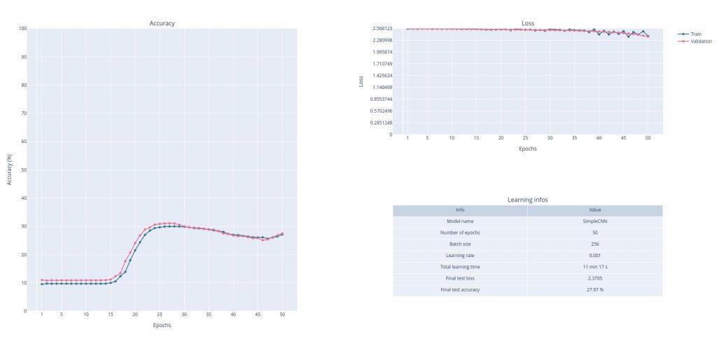
Side note: the learnings showed in this article are not that great. I am just trying a very simple model on a very few epochs. The idea is to have fast trainings to test my plots. Improving the models will be the next step.
The thing is, I will need to try many different models, and I want to easily compare them. I could just save the result given by matplotlib and compare the images manually. Honestly, for my usage, it was probably enough. Buuuuuut I wanted more. That’s where I started digging a little too deep and what was supposed to be just a little part of my project turned out to be a long exploration of how to create beautiful and interactive graphs.
There must be some already existing tools doing what I want… Please welcome TensorBoard
So my first thought was that surely, some tools already existed to monitor learnings. And I found a few ones :
- MLflow
- TensorBoard
- Weights & Biaises
- Probably a lot more…
For my usage, TensorBoard seemed to be the better suited, as it is easy to integrate with PyTorch and seems to be better for graphs and metrics. So I tried it.
The main idea is that you create a SummaryWriter that will log everything you want in a specified directory (by default ./runs). Then you add everything you want to save to your writer with the commands add_XXX. During the learning (or once finished), you can visualize what you’ve saved by running the command tensorboard --logdir=runs and opening http://localhost:6006 in your favorite web browser.
Here is an extract of my code:
from torch.utils.tensorboard import SummaryWriter
# Create unique name for each learning:
name = model_name + "-BS." + str(batch_size) + "-E." + str(epochs) + "-LR." + str(learning_rate) + "-" + str(start)
# Create writer:
writer = SummaryWriter(log_dir = "./runs/" + name)
# Add model to TensorBoard for visualization:
# Take first training batch as exemple
exemple_images, _ = next(iter(train_dataloader))
# Put images in a grid
grid = torchvision.utils.make_grid(exemple_images)
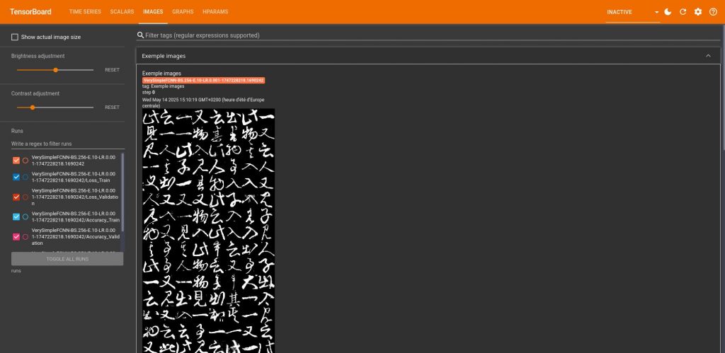
# Add the grid of images to TensorBoard to see what the data looks like
writer.add_image("Exemple images", grid)
# Add the model to TensorBoard, we need the exemple images to pass through the model for TensorBoard to get it
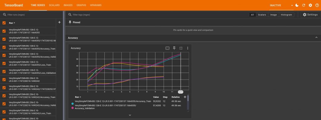
writer.add_graph(chosen_model, exemple_images)This code saves the first batch of images as an example that you can then see in your board under the tab “Images”:
And it also creates the graph of the model under the tab “Graphs”:
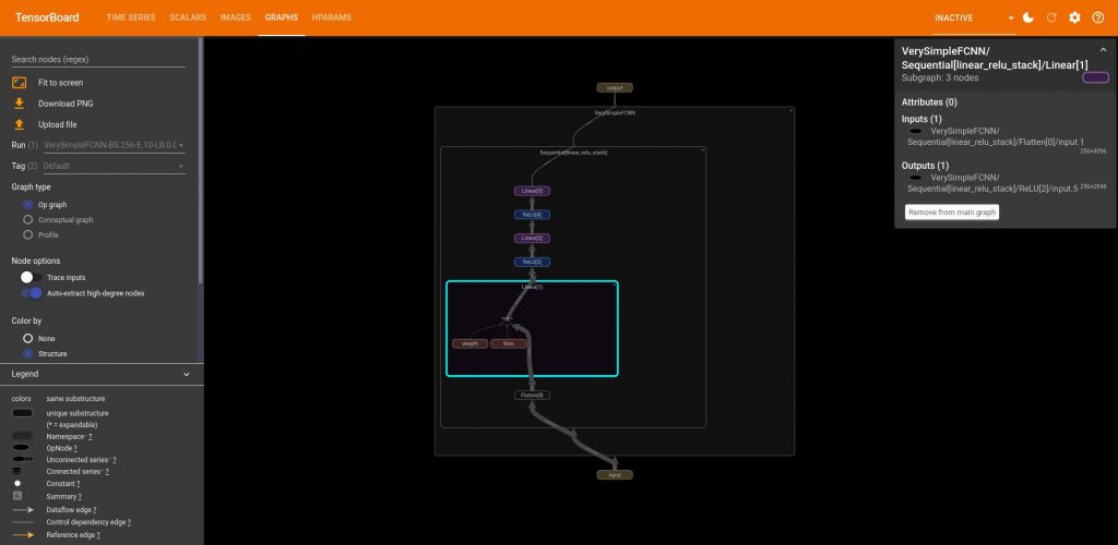
Something I didn’t immediately understand is that in order to plot the graph, you need to provide a data example, this allows TensorBoard to understand the structure of the model by simulating a forward pass.
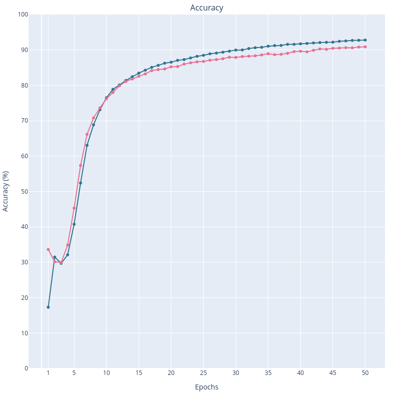
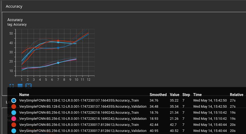
Now comes the most important part for me, saving and plotting the accuracy, the loss, and the other useful parameters. I’ve tried many things and to be honest, I think TensorBoard is really powerfull but not very intuitive. And I found pretty frustrating that you cannot customize most things. For example, I wanted all my training accuracies and losses to be a color A, and all the test ones to be color B. This way, when you compare 2 learnings curves you know easily which is which. Well you cannot do that in TensorBoard (or at least, I didn’t find how). It automatically chooses a new color for each curve. And when you have 4, 5 or more learnings, it easily becomes unreadable, and you constantly have to look back at the legend on the side, or put your mouse over the curve. And I don’t know about you, but I tend to forget the information “training accuracy for learning X is greenish-yellow-but-not-too-yellow” immediately after moving my mouse to another curve. For example, here is what it looks like with just 3 learnings:
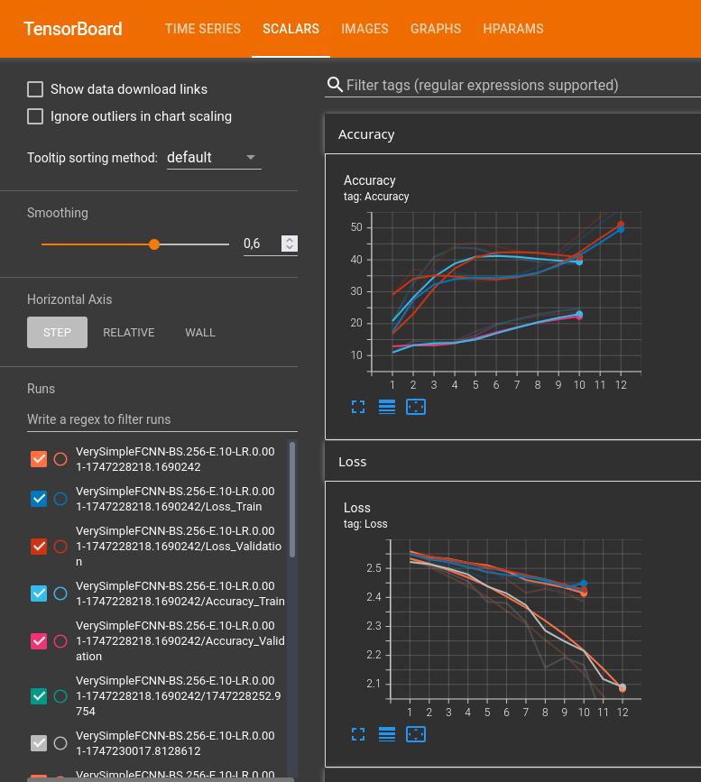
But still, here is an extract of my code to produce these plots:
# Save learning parameters in dict
params = {
    "Model used": models_dir + '.' + model_name,
    "Minimum of images per kanji": min_images_per_kanji,
    "Number of kanjis": nb_kanjis,
    "Batch size": batch_size,
    "Number of epochs": epochs,
    "Learning rate": learning_rate,
    "Number of workers for DataLoaders": nb_workers_dataloader
}

# Training:
for t in range(epochs):
  # […] do the training
  train_loss, train_accuracy = train(…)
  val_loss, val_accuracy = test(…)
  # Save accuracies
  writer.add_scalars("Loss", {
      "Train": train_loss,
      "Validation": val_loss
  }, t+1) # t+1 is the epoch number
  # Save losses
  writer.add_scalars("Accuracy", {
      "Train": train_accuracy,
      "Validation": val_accuracy
  }, t+1)

# Add params and global metrics to TensorBoard:
metrics = {
    "Total time": end - start,
    "Test accuracy": test_accuracy,
    "Test loss": test_loss,
}
writer.add_hparams(params, metrics)
Other useful commands:
# Force writing data on the disk
writer.flush()

# Close the writer
writer.close()
Finally, you might have noted that I also saved the learning parameters as hparams. When you have multiple learnings (here 3) you can compare them under the “Hparams” tab:
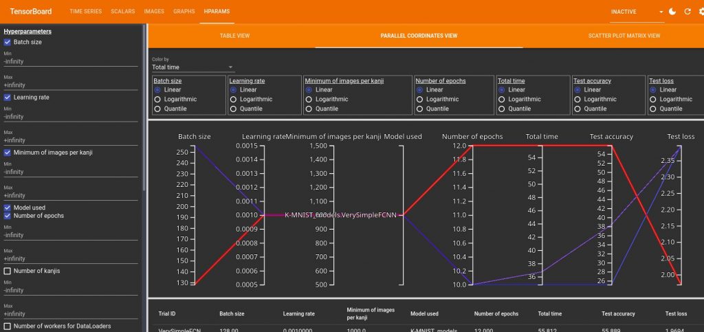
hparams for 3 different leanrings. By hover over one of them you can highlight it.It can be a bit disturbing to read but once you get it it can be very useful. Here you can see that my 3 learnings had the same learning rate, minimum number of images per kanji and same model. So I could deselect those. If I do that, I have the following graph:
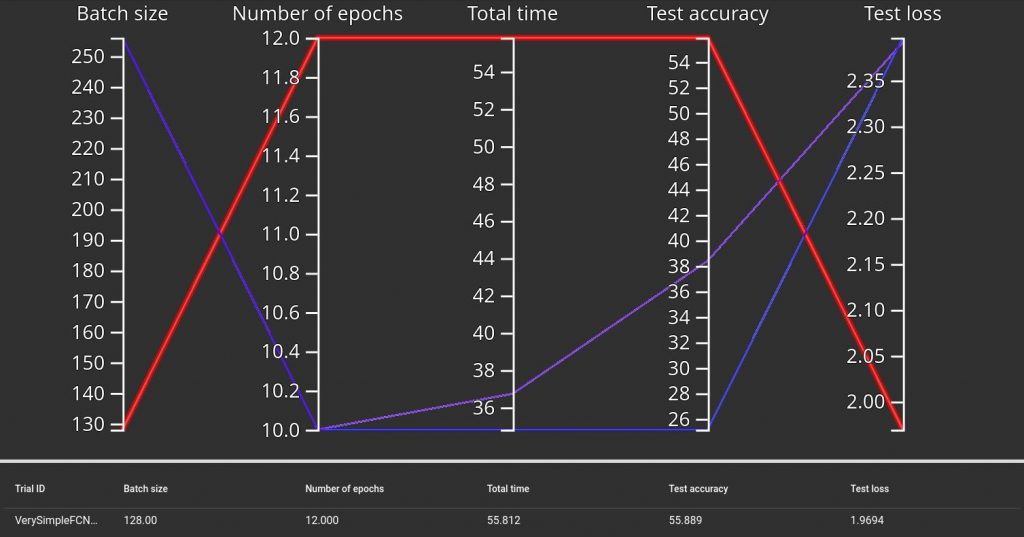
Not surprisingly, we see that the learning with the smaller batch size but higher number of epochs is longer to train but has a better final test accuracy (and also lower loss, which is normal). Here with only 3 trivial models we don’t learn much, but we can imagine that it can be useful to compare lots of models, and also to study the effect of each parameter. I should keep that in mind for later.
Yeah, but it is not perfectly what I have in mind. Let’s do everything by ourselves then, how difficult can it be?
You might have noticed that I was a bit frustrated with TensorBoard. So I finally decided to do it by myself using Plotly and Dash. I was thinking that this way I could really get what I had in mind and that it would be a great opportunity to improve my data vizualisation skills. And it did!
I chose Plotly because it is well integrated with Dash, in order to create interactive apps. I had also tried Panel in the past but I had found it a bit hard to understand, so I wanted to test something else.
I first ignored the interactive part and started by using only Plotly to reproduce the graphs I already had with matplotlib. It was easy to do the transition as Plotly is pretty intuitive. At first, I was passing directly the data to plot from my main script to Plotly, but I quickly changed that as at the end, I wanna be able to plot any previous learning (if saved of course). So I had to find a way to save the accuracies, losses and learning parameters. For the learning parameters, it was just a dictionary so I saved it as a JSON file. But the accuracies and losses were pandas DataFrames so I had to search how to save them. I decided to go with the HDF5 format as it seemed to be a high performance one.
So for each new learning I create a new folder (based on the end time of the learning), and I save everything in this folder:
if save:
  # Create new folder
  now = time.localtime()
  save_folder = f'{results_dir}/{now.tm_year}-{now.tm_mon}-{now.tm_mday}\
      _{now.tm_hour}-{now.tm_min}-{now.tm_sec}/'
  assert not os.path.exists(save_folder), f"{save_folder} already exists"
  os.makedirs(save_folder)
  # Save accuracies as HDF5 file
  store_acc = pd.HDFStore(save_folder + '/' + "df_accuracies.h5")
  store_acc['df'] = df_accuracies
  store_acc.close()
  # Save losses as HDF5 file
  store_loss = pd.HDFStore(save_folder + '/' + "df_losses.h5")
  store_loss['df'] = df_losses
  store_loss.close()
  # Save leanring infos as JSON file
  json.dump(infos, open(save_folder + '/' + 'infos.json', 'w'))
Then I can read the data in my plot script:
def read_data(directory: str) -> dict:
    '''
    Get results saved from a previous learning.

    Args:
        directory (str): path of directory for considered learning.
            Ex: "KMNIST_results/2025-4-24_19-46-44"

    Returns:
        dict: contains data from considered learning:
            - "df_accuracies" (pd.DataFrame): train and validation accuracy
            - "df_losses" (pd.DataFrame): train and validation loss
            - "infos" (dict): parameters and learning characteristics
    '''
    data = {}
    data["df_accuracies"] = pd.read_hdf(directory + '/df_accuracies.h5')
    data["df_losses"] = pd.read_hdf(directory + '/df_losses.h5')
    with open(directory + '/infos.json') as infos_file:
        data["infos"] = json.load(infos_file)
    return data
(Yeah at this time I also started to have docstrings and proper typing)
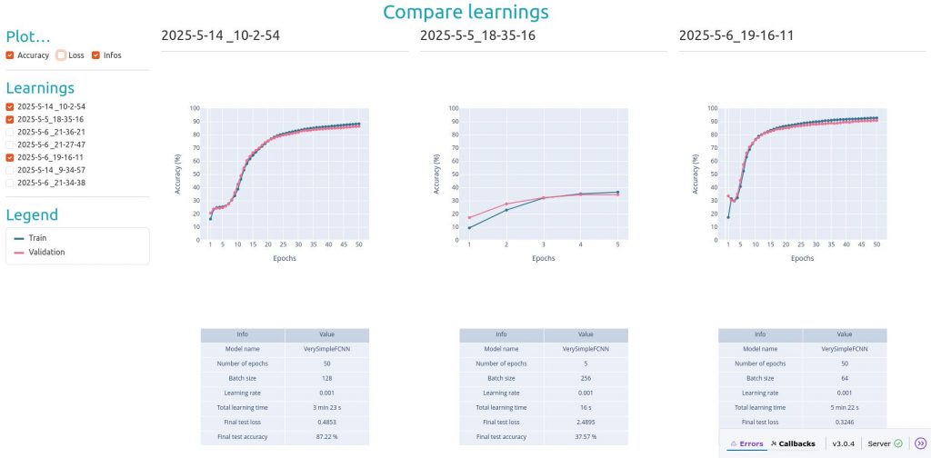
Another important point is that I wanted my script to perform 2 things:
- When called directly, produce an interactive app where I can select which learnings I want to draw and what I want to plot for each of them (that’s what my
mainfunction is doing). - When called from the main script (if learning parameter
showis set to 1), only plot accuracy, loss and infos for the current learning. this one doesn’t need to be interactive. That’s what myplot_resultsfunction is doing.
And I didn’t want to write everything twice so I needed those to functions to use the same graphs. This is the reason why I had to split each plotting function into 2 sub-functions : XXX_figure and plot_XXX. Because in main, I create a new figure for each plot, and those figures are encapsulated in a dcc.Graph, whereas in plot_results, I just create one big figure that is then split with make_subplots, and then I use add_trace to add the plots to each subplot. And I cheat a little bit because if row and col are set to None in add_trace, they are just ignored. So I can use them with plot_results and set them to None with main.
I will not go in details about how I wrote everything, you can see the complete script on my GitLab (it is the KMNIST_plot.py script), but I want to talk a little bit about Dash.
So Dash allows you to create interactive apps. You initialize the app and then describe its components. I think there are 2 main ideas to understand:
- The app layout is created with the following elements:
dbc.Container,dbc.Rowanddbc.Col. You create rows, and each row contains a list of columns. And each column then contains the elements you want to show, like an HTML heading, a checklist, a graph… - You add the interaction with callbacks, and especially
OutputandInputfunctions. In my case, I have checklists on the side (the list of saved learnings, and the list of what we can plot for each of them). Those checklists have a unique id, that are given to myInputs. TheOutputis the main plot. The callback function is used to update the main plot everytime something changes on the checklists. If we select a learning, then we add a new column, or if necessary a new row. If we select a new plot, then in each column of each row, we add the new plot.
So I am re-drawing everything everytime the user interacts with the app. It is not ideal, but I don’t see how I can do it otherwise if I want to have full control on what is showed or not (I guess I could generate all the plots at the beginning anyway, save them and just show them or not, but I don’t think it is worth it, as for the moment I don’t have latency).
Now let’s have a look at the final results!
Now that we have everything we need to compare learnings… We can start to learn! And see what we can discover in episode 3 then!